5 Best Practices for Your Salesforce Prospecting Dashboard

Introduction
Sales teams struggle with fragmented data, hindering their ability to derive actionable insights. A well-structured Salesforce prospecting dashboard highlights key metrics, allowing teams to track activities and identify trends effectively. Implementing best practices for dashboard optimization enhances decision-making and boosts revenue outcomes. Identifying the key components of an effective dashboard is crucial for driving sales success.
Understand the Role of Salesforce Prospecting Dashboards
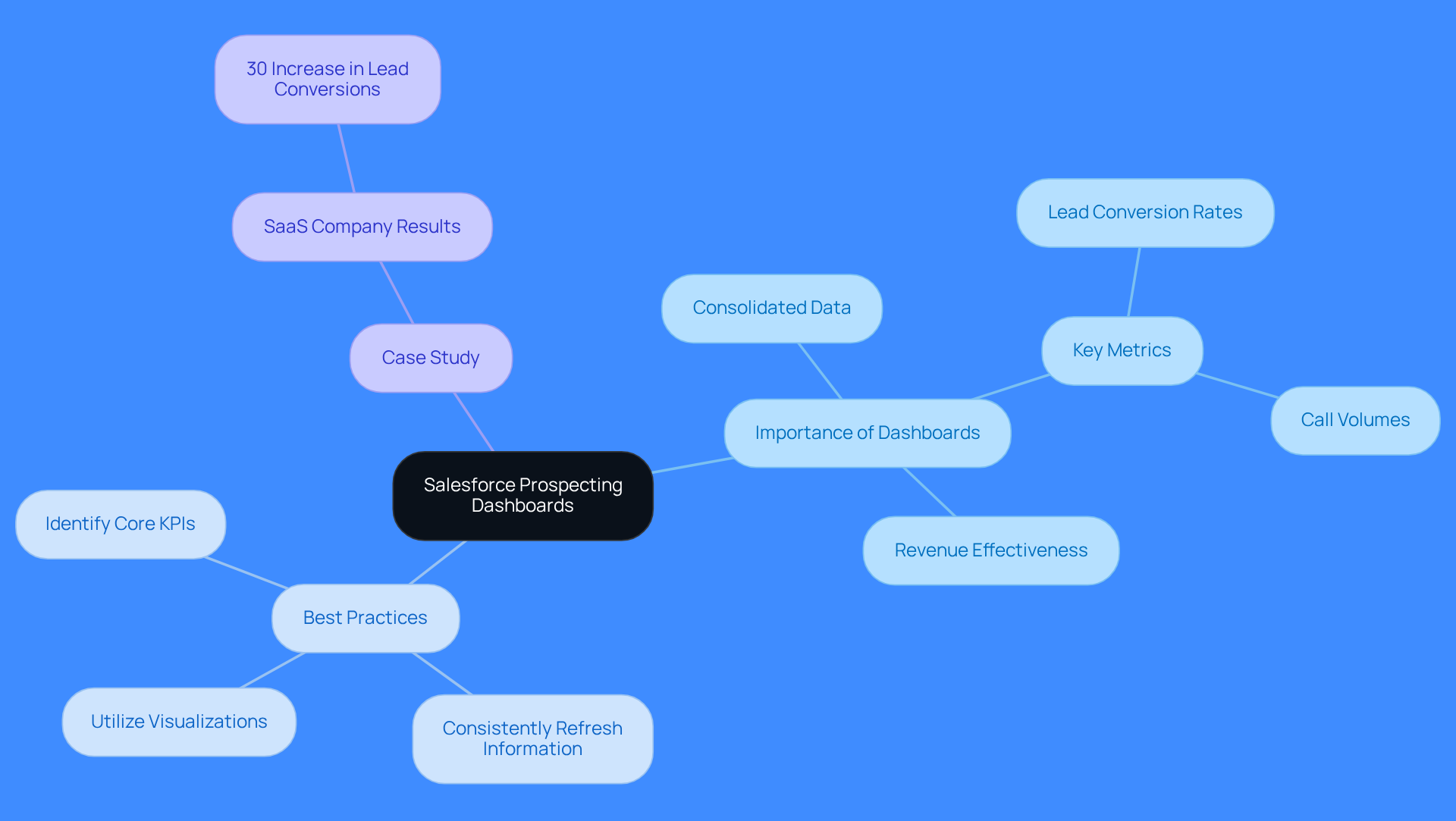
Sales teams often grapple with fragmented data that obscures performance insights. These displays consolidate data, enabling reps to track activities and spot trends quickly. Centralized data supports swift decisions and boosts revenue effectiveness. A well-organized interface shows key metrics like lead conversion rates and call volumes. This helps teams focus their efforts effectively. Teams tracking 5-7 key metrics achieve a 91% average quota, highlighting the importance of focused metric tracking for revenue success.
With Regie.ai, task orchestration for AI agents and human reps happens seamlessly within these dashboards. By automating high-quality outbound at scale, Regie.ai allows small teams to reach 3-5 times more accounts with personalized, signal-driven outreach that reps simply don’t have time to do manually. This integration guarantees that revenue teams can utilize actionable insights to connect the gap between activity and pipeline, enhancing their overall effectiveness.
As David Ashe, Senior Director of Global Sales Development, states, 'Sales measurements should assist you in enhancing performance.' If they’re just noise, they’re not doing their job.
Best Practices for Using Salesforce Prospecting Dashboards:
- Identify Core KPIs: Focus on 5-7 key performance indicators that align with your sales goals to achieve optimal results.
- Consistently Refresh Information: Ensure that your interface reflects real-time information for precise decision-making.
- Utilize Visualizations: Leverage graphs and charts to make intricate information easily understandable for your team.
Case Study Example: A SaaS company implemented a salesforce prospecting dashboard that highlighted their lead conversion rates and call volumes. Within three months, they reported a 30% increase in lead conversions, demonstrating the effectiveness of using centralized data to drive revenue success.
Identify Key Components of an Effective Dashboard
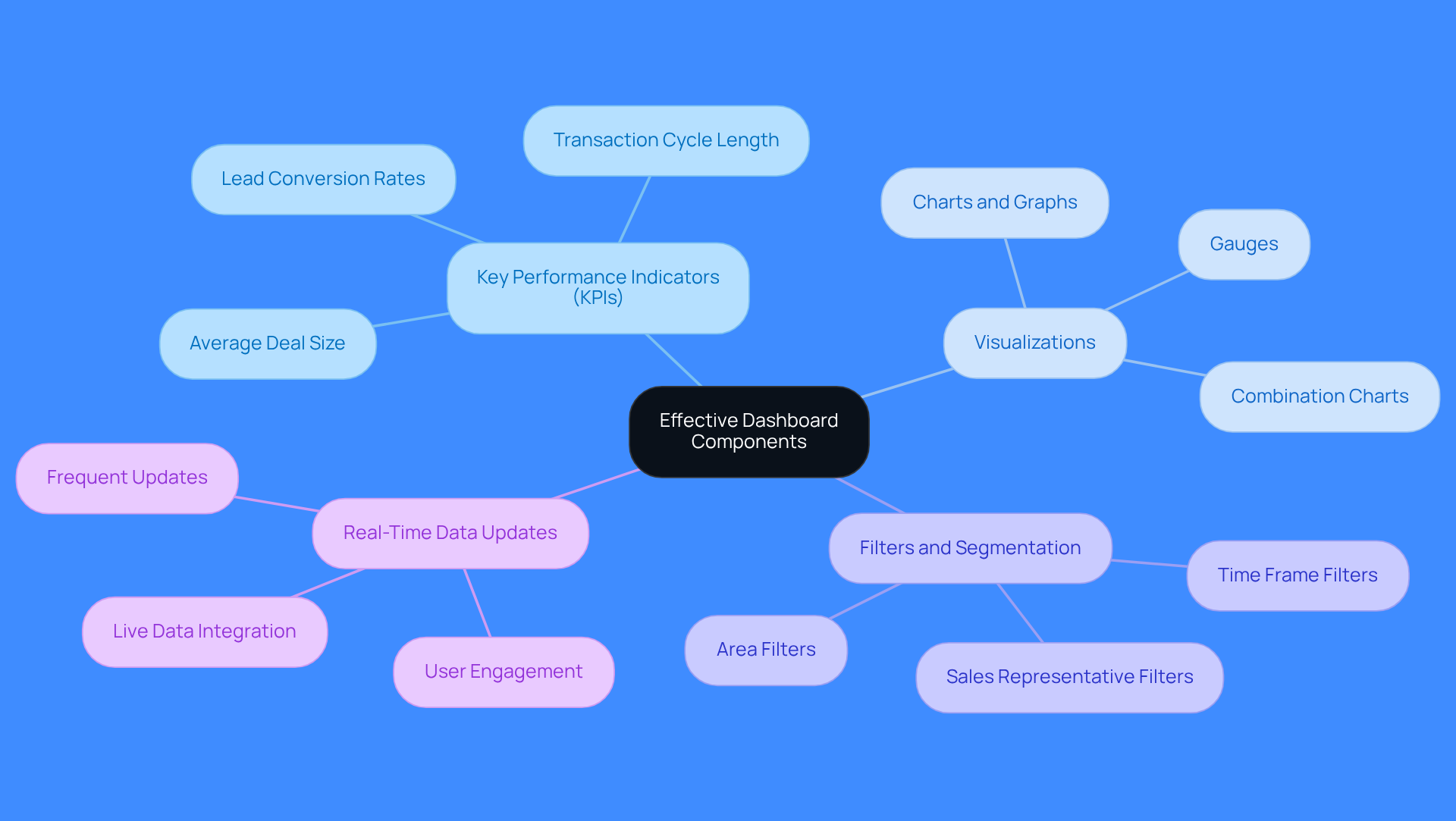
Sales teams need a salesforce prospecting dashboard that tackles fragmented data and drives actionable insights. Key components should include:
- Key Performance Indicators (KPIs): Metrics like lead conversion rates, average deal size, and transaction cycle length must be prominently displayed. For instance, showing average deal size by lead source can guide sales strategies and resource allocation.
- Visualizations: Use charts, graphs, and gauges to represent information visually, making it easier to interpret trends and performance at a glance. Effective dashboards often employ combination charts to visualize revenue alongside win rates, helping identify market fit issues.
- Filters and Segmentation: Enable users to refine information by time frames, sales representatives, or areas to obtain insights tailored to specific needs. This capability is crucial for sales teams to focus on relevant metrics and make informed decisions based on their unique contexts.
- Real-Time Data Updates: Ensure the interface pulls in live data to provide the most current insights. Displays that update frequently can avert performance problems and sustain user involvement, as slow-loading displays often result in reduced usage.
Integrating these components into the salesforce prospecting dashboard allows sales teams to visualize key metrics, which leads to informed decisions that enhance performance. Regie.ai significantly improves these visual displays by offering actionable insights that bridge the gap between sales efforts and pipeline. Its AI Dialer allows parallel dialing on up to nine lines, maximizing talk time. It also uses over 100 signals to prioritize leads based on genuine buying intent, ensuring teams connect with the right lead at the right moment. Regie.ai's recognition as a G2 Momentum Leader and Grid Leader adds credibility to its effectiveness in automating outreach and dynamically adjusting messaging based on engagement, persona, and intent signals. With Regie.ai, teams can ensure they engage the right leads at the right time, driving measurable revenue growth.
Customize Dashboards for Targeted Sales Outcomes
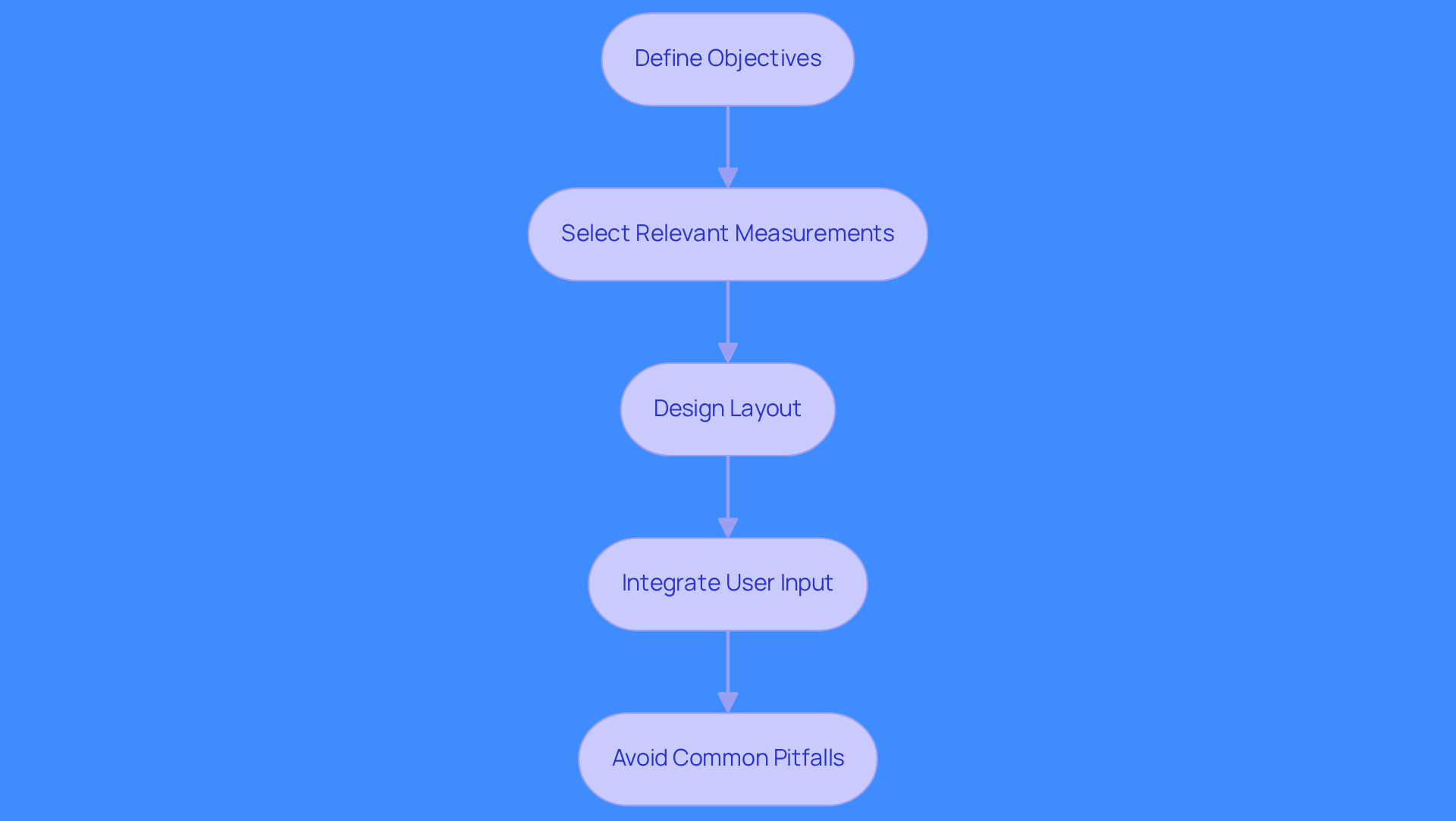
Tailoring the salesforce prospecting dashboard is essential for driving specific revenue outcomes. Here are steps to effectively tailor your dashboards:
- Define Objectives: Identify key sales goals, like increasing lead conversion rates or improving follow-up times. Clear objectives guide customization.
- Select Relevant Measurements: Choose indicators that correlate directly with your objectives. For example, if your aim is to enhance lead conversion, focus on lead response time and follow-up rates. Organizations using customer analytics outperform competitors in customer acquisition. Top sales experts stress the importance of clean data for effective dashboards.
- Design Layout: Organize the interface to prioritize critical information at the top, ensuring users can quickly access necessary data. This layout improves decision-making speed.
- Integrate User Input: Regular feedback ensures dashboards meet user needs. This approach helps dashboards adapt to changing sales strategies.
- Avoid Common Pitfalls: Be aware of challenges in customizing displays, like overloading them with information or failing to update metrics. Keeping the interface focused and relevant is crucial.
Sales teams can focus and drive results with personalized salesforce prospecting dashboards. Aligning performance indicators with revenue goals directly boosts performance metrics. For instance, the Lead Conversion Dashboard enhances lead acquisition strategies, while the Sales Pipeline Dashboard provides insights into deal health and pipeline coverage, improving transaction effectiveness. A well-structured dashboard not only clarifies data but also directly impacts revenue performance.
Leverage Data Visualization for Informed Decision-Making
Sales teams often struggle with decision-making due to ineffective data representation. Here are best practices for utilizing visualization effectively:
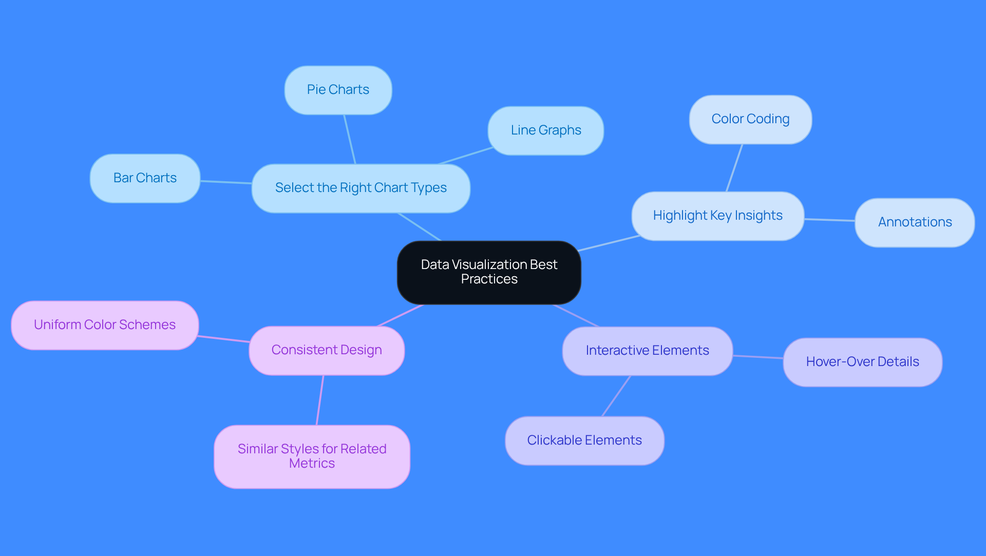
- Select the Right Chart Types: Use bar charts for comparisons, line graphs for trends, and pie charts for proportions. Selecting the right chart type boosts clarity and understanding.
- Highlight Key Insights: Use color coding or annotations to emphasize critical points, like increases in lead conversion rates or drops in sales performance.
- Interactive Elements: Incorporate interactive features that allow users to explore data for deeper insights, such as hover-over details or clickable elements.
- Consistent Design: Maintain a uniform design across all visualizations to avoid confusion. Use similar colors and styles for related metrics to create a cohesive look.
Implementing these visualization strategies can transform how sales teams operate and significantly boost performance.
Implement Continuous Improvement Practices for Dashboard Effectiveness
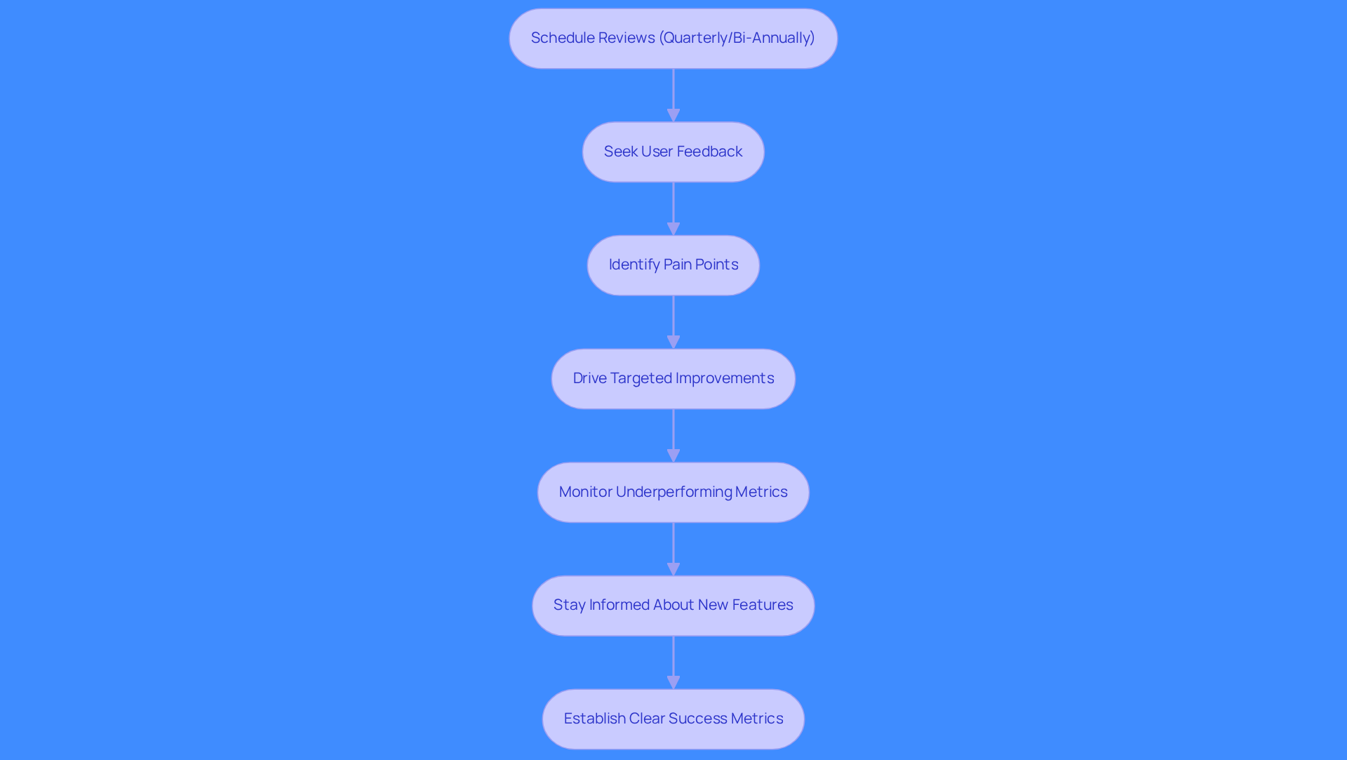
Salesforce prospecting dashboard displays must evolve to stay effective in a fast-paced sales environment. Schedule reviews quarterly or bi-annually based on sales changes. Actively seek user feedback to identify pain points and drive targeted improvements. Underperforming metrics hinder sales effectiveness and require immediate action. Stay informed about new features of the Salesforce prospecting dashboard that enhance display functionality. Establish clear success metrics linked to objectives for effective tracking. A culture of continuous improvement ensures that sales teams maximize the effectiveness of their displays. Organizations that prioritize continuous improvement can transform their data into actionable insights, driving better business outcomes.
Conclusion
Sales teams often struggle with fragmented data and inefficient workflows, leading to missed opportunities. Salesforce prospecting dashboards consolidate data and deliver actionable insights to enhance sales performance. Focusing on key KPIs and effective visualizations helps teams make better decisions and drive revenue growth. Integrating Regie.ai enables teams to automate outreach and personalize messaging based on real-time signals.
Identifying core KPIs and ensuring real-time updates are essential for effective dashboards. A SaaS company saw a 30% increase in lead conversions by implementing well-structured dashboards. Continuous improvement keeps dashboards relevant and effective in a changing sales environment.
Embracing these practices with Regie.ai can transform sales efforts, driving measurable revenue growth and operational efficiency.
Frequently Asked Questions
What is the purpose of Salesforce prospecting dashboards?
Salesforce prospecting dashboards consolidate fragmented data, enabling sales teams to track activities, spot trends quickly, and make swift decisions to boost revenue effectiveness.
How can teams benefit from using Salesforce prospecting dashboards?
Teams can focus their efforts effectively by tracking 5-7 key metrics, which can lead to achieving a 91% average quota, highlighting the importance of focused metric tracking for revenue success.
What role does Regie.ai play in enhancing Salesforce prospecting dashboards?
Regie.ai automates task orchestration for AI agents and human reps within these dashboards, allowing small teams to reach 3-5 times more accounts with personalized, signal-driven outreach.
What are some best practices for using Salesforce prospecting dashboards?
Best practices include identifying core KPIs, consistently refreshing information for real-time insights, and utilizing visualizations like graphs and charts to make complex data easily understandable.
Can you provide an example of the effectiveness of Salesforce prospecting dashboards?
A SaaS company that implemented a Salesforce prospecting dashboard reported a 30% increase in lead conversions within three months, demonstrating the effectiveness of centralized data in driving revenue success.
What key components should an effective Salesforce prospecting dashboard include?
Key components should include key performance indicators (KPIs), visualizations, filters and segmentation, and real-time data updates to provide actionable insights tailored to specific needs.
How does Regie.ai improve the effectiveness of sales dashboards?
Regie.ai enhances visual displays by offering actionable insights that bridge the gap between sales efforts and pipeline, and its AI Dialer allows parallel dialing on up to nine lines to maximize talk time.
What recognition has Regie.ai received that supports its effectiveness?
Regie.ai has been recognized as a G2 Momentum Leader and Grid Leader, which adds credibility to its effectiveness in automating outreach and dynamically adjusting messaging based on engagement, persona, and intent signals.
List of Sources
- Understand the Role of Salesforce Prospecting Dashboards
- 40 Sales Statistics to Watch for in 2026 (https://salesforce.com/sales/state-of-sales/sales-statistics)
- 6 Sales Metrics Every Sales Leader Should Track (and Why They Matter) (https://allego.com/blog/improve-sales-performance-metrics)
- 107 Sales Motivational Quotes for Work (https://pipedrive.com/en/blog/motivational-sales-quotes)
- Sales Metrics Dashboard: 15 Essential KPIs to Track (https://optif.ai/media/articles/sales-metrics-dashboard-15-kpis)
- The Productivity Gap: New Survey Shows 9 in 10 Sellers Are Betting on AI and Agents To Help (https://salesforce.com/news/stories/state-of-sales-report-announcement-2026)
- Identify Key Components of an Effective Dashboard
- Top 11 Salesforce Summer ‘26 Features for Admins (https://salesforceben.com/top-11-salesforce-summer-26-features-for-admins)
- Customizing Salesforce Dashboards: A Complete 2026 Guide (https://itechcloudsolution.com/blogs/customizing-salesforce-dashboards)
- Salesforce Dashboard Examples: 5 Complete Specs (2026) (https://improvado.io/blog/salesforce-dashboard)
- Best New Salesforce Features (2025–2026) Explained (https://cremanski.com/magazine/the-best-new-salesforce-features-2025-2026)
- Jen’s Top Summer '26 Release Features For Admins - Salesforce Admins (https://admin.salesforce.com/blog/2026/jens-top-summer-26-release-features-for-admins)
- Customize Dashboards for Targeted Sales Outcomes
- The Productivity Gap: New Survey Shows 9 in 10 Sellers Are Betting on AI and Agents To Help (https://salesforce.com/news/stories/state-of-sales-report-announcement-2026)
- 10 Sales Performance Dashboard Examples That Will Help You Drive Results (https://captivateiq.com/blog/sales-performance-dashboard-examples)
- Custom Analytics Dashboard: Turning Data into Margin - Home Furnishings Association (https://myhfa.org/blog/custom-analytics-dashboard-turning-data-into-margin)
- Top 6 Salesforce Dashboards to Boost Revenue Performance (https://altahq.com/post/6-must-have-salesforce-dashboards-for-maximizing-revenue)
- Sales Dashboard Examples (https://sigmacomputing.com/blog/sales-dashboard-examples)
- Leverage Data Visualization for Informed Decision-Making
- How Data Visualization Improves Decision-Making in 2026 (https://blacklabel.net/blog/business-insights/data-driven-decision-making-what-leaders-should-know-about-visualization)
- Data Visualization’s Positive Impact on Decision Making | MapBusinessOnline (https://mapbusinessonline.com/Article.aspx/Decision-Making)
- Dynamic Decision Making through Data Visualization (https://fox.temple.edu/news/dynamic-decision-making-through-data-visualization)
- The importance of data visualization for business decision-making | think-cell (https://think-cell.com/en/resources/content-hub/role-of-data-visualization-in-business-decision-making)
- 10 Trends in Data Visualization to Watch in 2026 - Infogram (https://infogram.com/blog/10-trends-in-data-visualization-to-watch-in-2026)
- Implement Continuous Improvement Practices for Dashboard Effectiveness
- The Perfect Sales Dashboard: 11 KPIs You Can't Miss (https://xactlycorp.com/blog/sales-performance/perfect-sales-dashboard-11-kpis-cant-miss)
- Making Reporting Ubiquitous: A sneak peek at the Reports & Dashboards roadmap (https://salesforce.com/blog/reports-and-dashboards-roadmap)
- 5 Big Ways to Maximize Your Salesforce Dashboards – CloudAmp News (https://cloudamp.com/news/5-big-ways-to-maximize-your-salesforce-dashboards-guest-post-on-the-salesforce-blog)
- Study: 84% of Technical Leaders Need Data Overhaul for AI Strategies to Succeed (https://salesforce.com/news/stories/data-analytics-trends-2026)
- Best New Salesforce Features (2025–2026) Explained (https://cremanski.com/magazine/the-best-new-salesforce-features-2025-2026)
FAQs
Read more posts
View all Blogs

Need more help?
If you still have questions, make sure to check out our Help Center: there, you'll find all the tips & advice you'll need to get your team up & running with Regie.ai.